Flutter Feature Grid: Three-Column Highlights
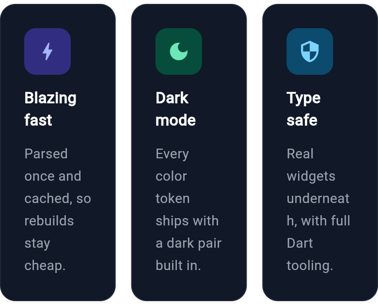
A three-column feature grid with icon tiles, titles, and short descriptions. A marketing section built with Wind UI utility classes and full dark mode support.
WDiv(
  className: 'mx-auto max-w-3xl flex flex-row gap-4',
  children: [
    WDiv(
      className: 'flex-1 flex flex-col gap-3 rounded-2xl border p-6 bg-white border-gray-200 shadow-sm dark:bg-gray-900 dark:border-gray-800',
      children: [
        WDiv(
          className: 'flex items-center justify-center w-12 h-12 rounded-xl bg-indigo-100 dark:bg-indigo-900',
          child: WIcon(
            Icons.bolt,
            className: 'text-indigo-600 text-2xl dark:text-indigo-300'
          )
        ),
        WText(
          'Blazing fast',
          className: 'text-base font-bold text-gray-900 dark:text-white'
        ),
        WText(
          'Parsed once and cached, so rebuilds stay cheap.',
          className: 'text-sm text-gray-500 dark:text-gray-400 leading-relaxed'
        ),
      ],
    ),
    WDiv(
      className: 'flex-1 flex flex-col gap-3 rounded-2xl border p-6 bg-white border-gray-200 shadow-sm dark:bg-gray-900 dark:border-gray-800',
      children: [
        WDiv(
          className: 'flex items-center justify-center w-12 h-12 rounded-xl bg-emerald-100 dark:bg-emerald-900',
          child: WIcon(
            Icons.dark_mode,
            className: 'text-emerald-600 text-2xl dark:text-emerald-300'
          )
        ),
        WText(
          'Dark mode',
          className: 'text-base font-bold text-gray-900 dark:text-white'
        ),
        WText(
          'Every color token ships with a dark pair built in.',
          className: 'text-sm text-gray-500 dark:text-gray-400 leading-relaxed'
        ),
      ],
    ),
    WDiv(
      className: 'flex-1 flex flex-col gap-3 rounded-2xl border p-6 bg-white border-gray-200 shadow-sm dark:bg-gray-900 dark:border-gray-800',
      children: [
        WDiv(
          className: 'flex items-center justify-center w-12 h-12 rounded-xl bg-sky-100 dark:bg-sky-900',
          child: WIcon(
            Icons.security,
            className: 'text-sky-600 text-2xl dark:text-sky-300'
          )
        ),
        WText(
          'Type safe',
          className: 'text-base font-bold text-gray-900 dark:text-white'
        ),
        WText(
          'Real widgets underneath, with full Dart tooling.',
          className: 'text-sm text-gray-500 dark:text-gray-400 leading-relaxed'
        ),
      ],
    ),
  ],
)
Benzer örnekler
-
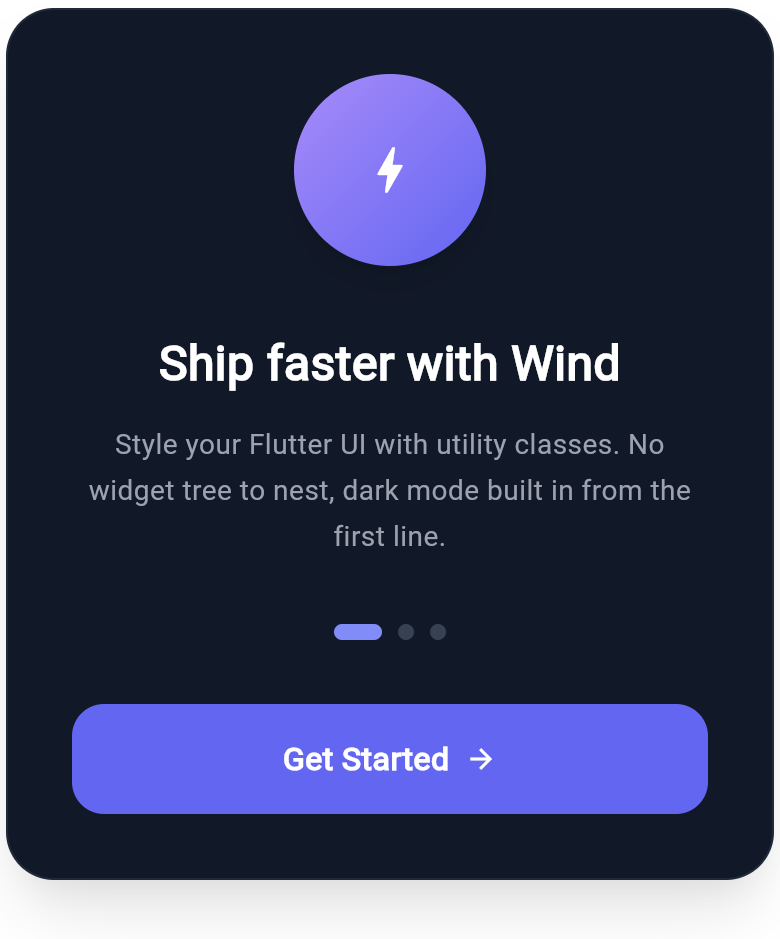
Flutter Onboarding Slide with Feature Highlight and Page Dots
A polished onboarding slide built with Wind utility classes: a gradient feature icon, a bold headline, supporting copy, page indicator dots, and a full-width call to action. Dark mode pairs are included on every color token.
-
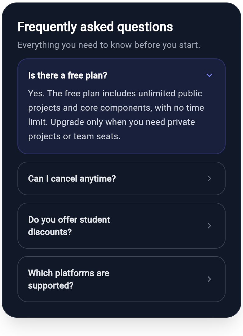
Flutter FAQ Accordion Card with Expandable Answers
A frequently asked questions accordion: the first item is expanded with its answer and a down chevron, while the rest stay collapsed with a forward chevron. A clean support and help-center pattern built with Wind utility classes and dark-mode pairing.
-
Flutter Cookie Consent Privacy Banner
A privacy and cookie consent banner for web and mobile: an icon header, a plain-language explanation, an always-on essentials note, and a clear action hierarchy of accept, customize, and reject. A reusable compliance pattern composed from Wind className strings with dark-mode pairs.