Flutter Component Search Card with Live Suggestions
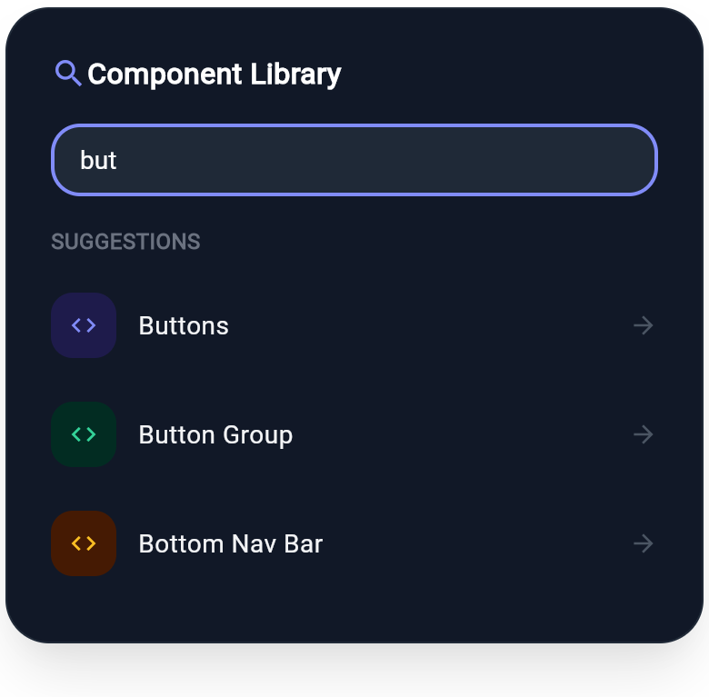
A component search card built on the real WInput widget, with a focused search field and a categorized suggestion list. Demonstrates Wind form inputs with icon tiles and dark-mode pairs.
WDiv(
  className: 'max-w-sm w-full mx-auto p-6 rounded-3xl bg-white dark:bg-gray-900 border border-gray-200 dark:border-gray-800 shadow-xl',
  children: [
    WDiv(
      className: 'flex flex-row items-center w-full mb-4',
      children: [
        WIcon(
          Icons.search,
          className: 'text-indigo-600 dark:text-indigo-400 text-xl mr-2'
        ),
        WText(
          'Component Library',
          className: 'text-gray-900 dark:text-white text-base font-bold'
        ),
      ],
    ),
    WInput(
      value: "but",
      type: "text",
      placeholder: "Search components...",
      className: 'w-full px-4 py-3 rounded-2xl border-2 border-indigo-500 dark:border-indigo-400 bg-gray-50 dark:bg-gray-800 text-gray-900 dark:text-white text-sm mb-4',
    ),
    WText(
      'Suggestions',
      className: 'text-gray-400 dark:text-gray-500 text-xs font-bold uppercase mb-2'
    ),
    WButton(
      className: 'w-full py-3',
      child: WDiv(
        className: 'flex flex-row items-center justify-between w-full',
        children: [
          WDiv(
            className: 'flex flex-row items-center',
            children: [
              WDiv(
                className: 'w-9 h-9 rounded-xl bg-indigo-50 dark:bg-indigo-950 flex flex-row items-center justify-center mr-3',
                child: WIcon(
                  Icons.code,
                  className: 'text-indigo-600 dark:text-indigo-400 text-base'
                ),
              ),
              WText(
                'Buttons',
                className: 'text-gray-800 dark:text-gray-100 text-sm font-medium'
              ),
            ],
          ),
          WIcon(
            Icons.arrow_forward,
            className: 'text-gray-300 dark:text-gray-600 text-base'
          ),
        ],
      ),
    ),
    WDiv(
      className: 'h-px w-full bg-gray-100 dark:bg-gray-800',
      children: []
    ),
    WButton(
      className: 'w-full py-3',
      child: WDiv(
        className: 'flex flex-row items-center justify-between w-full',
        children: [
          WDiv(
            className: 'flex flex-row items-center',
            children: [
              WDiv(
                className: 'w-9 h-9 rounded-xl bg-emerald-50 dark:bg-emerald-950 flex flex-row items-center justify-center mr-3',
                child: WIcon(
                  Icons.code,
                  className: 'text-emerald-600 dark:text-emerald-400 text-base'
                ),
              ),
              WText(
                'Button Group',
                className: 'text-gray-800 dark:text-gray-100 text-sm font-medium'
              ),
            ],
          ),
          WIcon(
            Icons.arrow_forward,
            className: 'text-gray-300 dark:text-gray-600 text-base'
          ),
        ],
      ),
    ),
    WDiv(
      className: 'h-px w-full bg-gray-100 dark:bg-gray-800',
      children: []
    ),
    WButton(
      className: 'w-full py-3',
      child: WDiv(
        className: 'flex flex-row items-center justify-between w-full',
        children: [
          WDiv(
            className: 'flex flex-row items-center',
            children: [
              WDiv(
                className: 'w-9 h-9 rounded-xl bg-amber-50 dark:bg-amber-950 flex flex-row items-center justify-center mr-3',
                child: WIcon(
                  Icons.code,
                  className: 'text-amber-600 dark:text-amber-400 text-base'
                ),
              ),
              WText(
                'Bottom Nav Bar',
                className: 'text-gray-800 dark:text-gray-100 text-sm font-medium'
              ),
            ],
          ),
          WIcon(
            Icons.arrow_forward,
            className: 'text-gray-300 dark:text-gray-600 text-base'
          ),
        ],
      ),
    ),
  ],
)
More like this
-
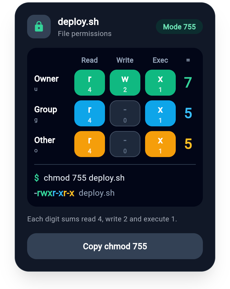
Flutter File Permission Card with rwx Grid and Octal Mode Readout
A Flutter file permission card for DevOps dashboards, hosting panels and learning apps: a terminal-style grid of owner, group and other against read, write and execute, bits worth 4, 2 and 1 summing to the octal digits of mode 755, plus the chmod command and the -rwxr-xr-x listing. Built with wind_kit.
-
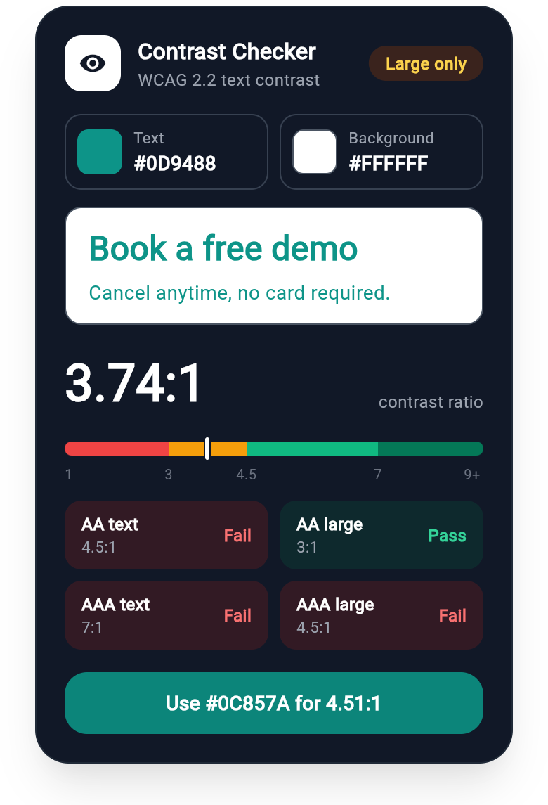
Flutter Contrast Checker Card with WCAG AA and AAA Pass Badges
A WCAG 2.2 colour contrast card for design system and accessibility apps: text and background swatches, a live preview of body and large text, the 3.74:1 ratio on a threshold scale, AA and AAA pass or fail tiles for normal and large text, and a one-tap fix to the nearest passing shade.
-
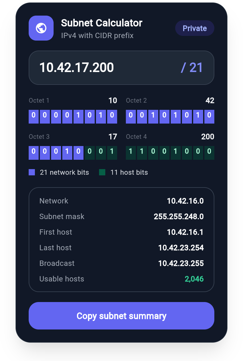
Flutter Subnet Calculator Card with 32 Bit Network and Host Grid
A Flutter subnet calculator card for network and developer tools: an IPv4 address with its CIDR prefix, all 32 bits by octet with network and host bits in two colours, plus network, mask, first and last host, broadcast and usable hosts. A correct /21 worked example built with wind_kit.