Flutter Pricing Card with Tailwind-Style className
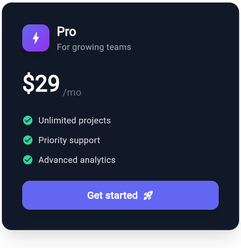
A SaaS pricing card built with Wind UI utility classes: icon badge, plan name, monthly price, a checkmark feature list, and a full-width CTA. Dark mode included.
WDiv(
  className: 'mx-auto max-w-sm flex flex-col gap-6 rounded-2xl border p-8 bg-white border-gray-200 shadow-xl dark:bg-gray-900 dark:border-gray-800',
  children: [
    WDiv(
      className: 'flex flex-row items-center gap-3',
      children: [
        WDiv(
          className: 'flex items-center justify-center w-11 h-11 rounded-xl bg-gradient-to-br from-indigo-500 to-purple-600 shadow-lg',
          child: WIcon(
            Icons.bolt,
            className: 'text-white text-2xl'
          ),
        ),
        WDiv(
          className: 'flex flex-col',
          children: [
            WText(
              'Pro',
              className: 'text-xl font-bold text-gray-900 dark:text-white'
            ),
            WText(
              'For growing teams',
              className: 'text-sm text-gray-500 dark:text-gray-400'
            ),
          ],
        ),
      ],
    ),
    WDiv(
      className: 'flex flex-row items-end gap-1',
      children: [
        WText(
          '$29',
          className: 'text-4xl font-extrabold text-gray-900 dark:text-white'
        ),
        WText(
          '/mo',
          className: 'text-base font-medium text-gray-400 dark:text-gray-500'
        ),
      ],
    ),
    WDiv(
      className: 'flex flex-col gap-3',
      children: [
        WDiv(
          className: 'flex flex-row items-center gap-2',
          children: [
            WIcon(
              Icons.check_circle,
              className: 'text-emerald-500 text-lg dark:text-emerald-400'
            ),
            WText(
              'Unlimited projects',
              className: 'text-sm text-gray-700 dark:text-gray-300'
            )
          ]
        ),
        WDiv(
          className: 'flex flex-row items-center gap-2',
          children: [
            WIcon(
              Icons.check_circle,
              className: 'text-emerald-500 text-lg dark:text-emerald-400'
            ),
            WText(
              'Priority support',
              className: 'text-sm text-gray-700 dark:text-gray-300'
            )
          ]
        ),
        WDiv(
          className: 'flex flex-row items-center gap-2',
          children: [
            WIcon(
              Icons.check_circle,
              className: 'text-emerald-500 text-lg dark:text-emerald-400'
            ),
            WText(
              'Advanced analytics',
              className: 'text-sm text-gray-700 dark:text-gray-300'
            )
          ]
        ),
      ],
    ),
    WButton(
      className: 'w-full rounded-xl px-5 py-3 bg-indigo-600 hover:bg-indigo-500 shadow-lg dark:bg-indigo-500 dark:hover:bg-indigo-400',
      child: WDiv(
        className: 'flex flex-row items-center justify-center gap-2',
        children: [
          WText(
            'Get started',
            className: 'text-base font-semibold text-white'
          ),
          WIcon(
            Icons.rocket_launch,
            className: 'text-white text-lg'
          )
        ],
      ),
    ),
  ],
)
More like this
-
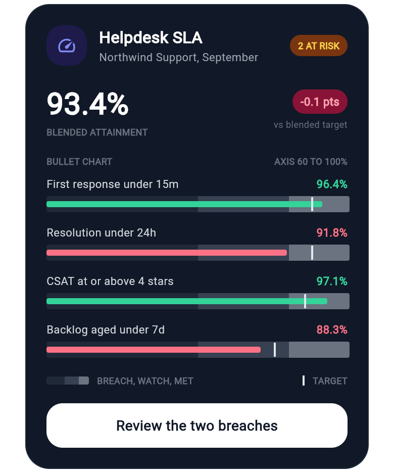
Flutter SLA Scorecard Card with Bullet Chart Target Markers
A Flutter SLA scorecard card for support desk dashboards: bullet charts with qualitative bands, a thick actual-value bar and a vertical target tick, so a missed target shows at a glance instead of hiding in a percentage. Built with wind_kit utility classes, dark mode pairs, no chart package.
-
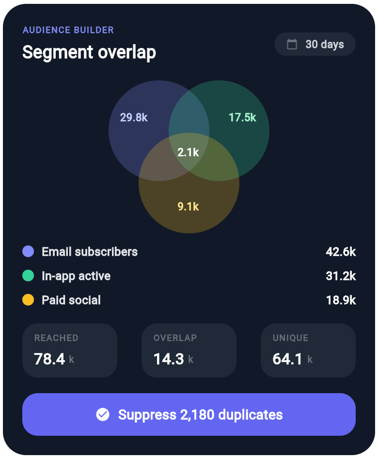
Flutter Audience Overlap Card with Three Circle Venn Segments
A Flutter audience overlap card for marketing and growth dashboards: three translucent circles form a real Venn diagram, so shared regions darken by themselves and each lobe shows its count, with a segment legend, reach and overlap tiles and a suppression action. wind_kit only, no chart library.
-
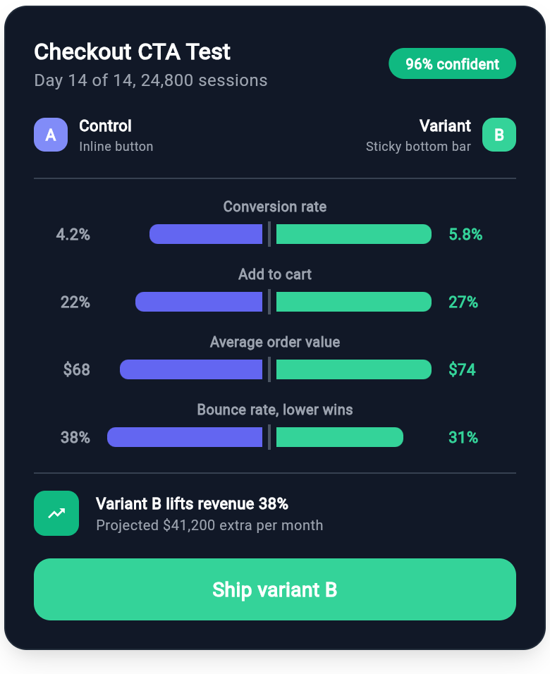
Flutter A/B Test Results Card with Mirrored Variant Bars
An experiment readout where control and variant grow away from a shared centre axis, one metric per row, so which side wins is obvious before you read a single number. Ends with the projected revenue lift and a ship decision.