Flutter Success Toast Notification
A floating success toast with an icon, a title, a message, and an action link. An ephemeral feedback pattern built with Wind UI className utilities and dark mode.
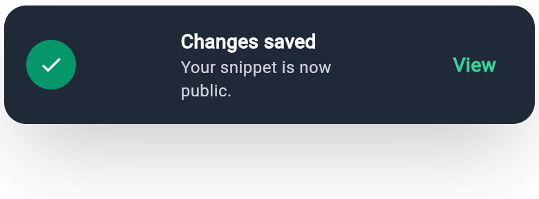
WDiv(
  className: 'mx-auto max-w-sm flex flex-row items-center justify-between gap-3 rounded-2xl p-4 bg-gray-900 shadow-2xl dark:bg-gray-800',
  children: [
    WDiv(
      className: 'flex items-center justify-center w-9 h-9 rounded-full bg-emerald-500 dark:bg-emerald-600',
      child: WIcon(
        Icons.check,
        className: 'text-white text-lg'
      )
    ),
    WDiv(
      className: 'flex flex-col',
      children: [
        WText(
          'Changes saved',
          className: 'text-sm font-semibold text-white'
        ),
        WText(
          'Your snippet is now public.',
          className: 'text-xs text-gray-400 dark:text-gray-300'
        ),
      ],
    ),
    WButton(
      className: 'rounded-lg px-3 py-1.5 hover:bg-white/10',
      child: WText(
        'View',
        className: 'text-sm font-semibold text-emerald-400'
      )
    ),
  ],
)
More like this
-
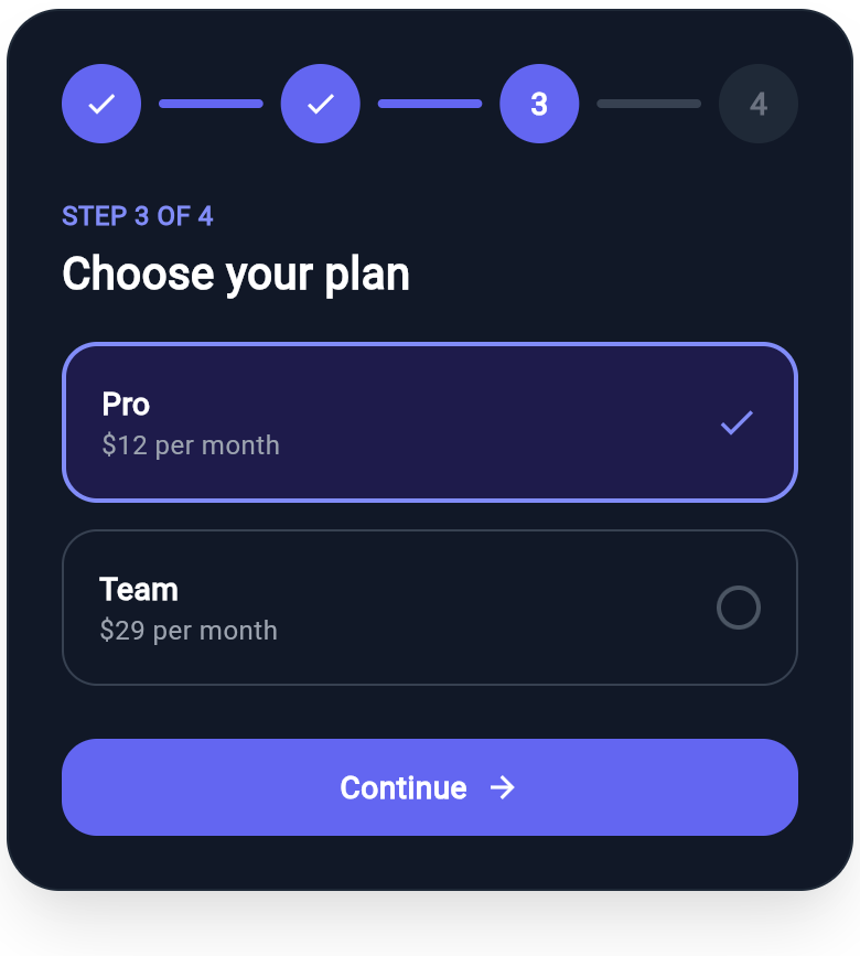
Flutter Progress Stepper Wizard with Plan Selection
A multi-step wizard header with a connected step rail (completed, active, and upcoming states) over a plan selection step and a continue button, all composed from Wind utility classes.
-
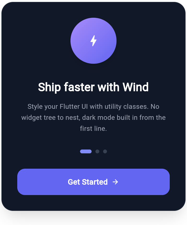
Flutter Onboarding Slide with Feature Highlight and Page Dots
A polished onboarding slide built with Wind utility classes: a gradient feature icon, a bold headline, supporting copy, page indicator dots, and a full-width call to action. Dark mode pairs are included on every color token.
-
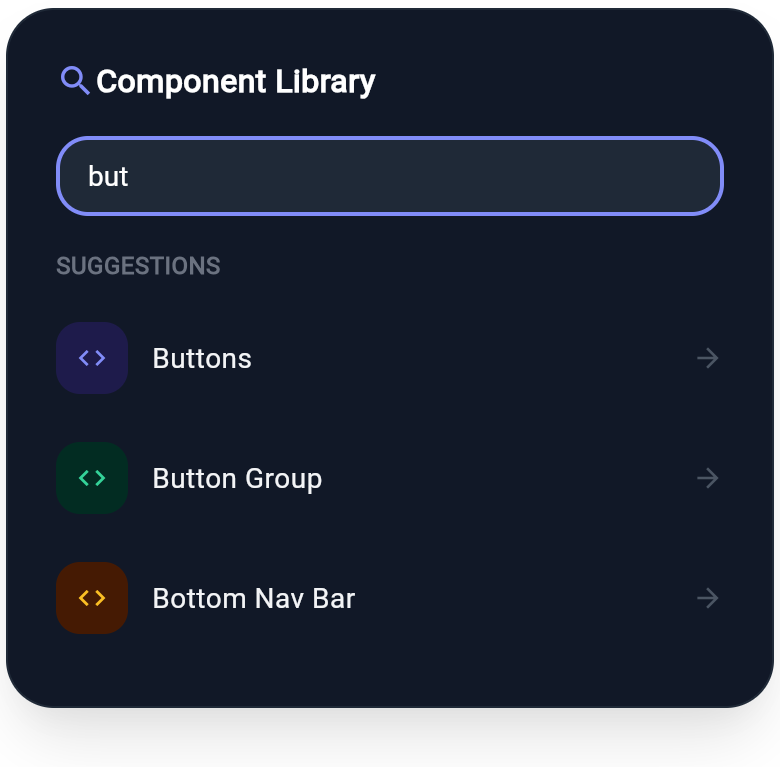
Flutter Component Search Card with Live Suggestions
A component search card built on the real WInput widget, with a focused search field and a categorized suggestion list. Demonstrates Wind form inputs with icon tiles and dark-mode pairs.