Flutter Contact Form Card with Name, Email, and Message
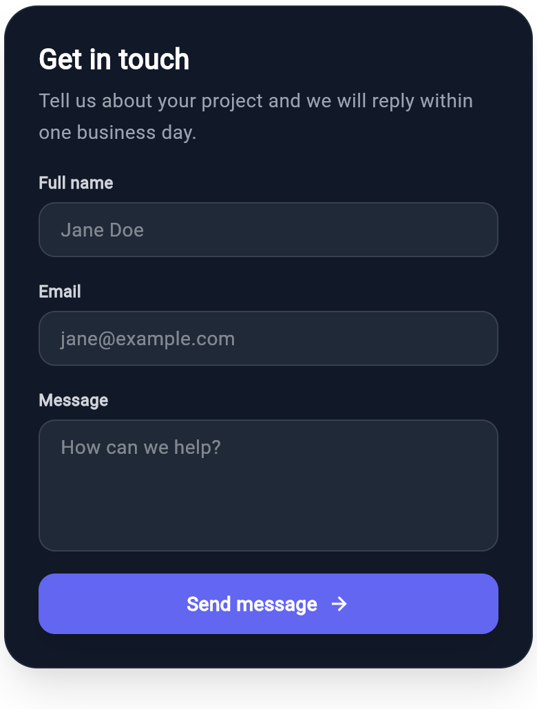
A get-in-touch form built from real WInput fields: a labeled name field, an email field, and a multiline message area, finished with a full-width send button. Shows Wind's text input across single-line and multiline types, no MaterialApp required, with full dark-mode pairing.
WDiv(
  className: 'flex flex-col gap-4 w-full max-w-sm p-6 rounded-3xl bg-white dark:bg-gray-900 border border-gray-200 dark:border-gray-800 shadow-xl',
  children: [
    WDiv(
      className: 'flex flex-col gap-1',
      children: [
        WText(
          'Get in touch',
          className: 'text-xl font-bold text-gray-900 dark:text-white'
        ),
        WText(
          'Tell us about your project and we will reply within one business day.',
          className: 'text-sm leading-relaxed text-gray-500 dark:text-gray-400'
        ),
      ],
    ),
    WDiv(
      className: 'flex flex-col gap-1.5',
      children: [
        WText(
          'Full name',
          className: 'text-xs font-semibold text-gray-600 dark:text-gray-300'
        ),
        WInput(
          type: "text",
          placeholder: "Jane Doe",
          className: 'w-full px-4 py-3 rounded-xl border border-gray-200 dark:border-gray-700 bg-gray-50 dark:bg-gray-800 text-sm text-gray-700 dark:text-gray-200',
        ),
      ],
    ),
    WDiv(
      className: 'flex flex-col gap-1.5',
      children: [
        WText(
          'Email',
          className: 'text-xs font-semibold text-gray-600 dark:text-gray-300'
        ),
        WInput(
          type: "email",
          placeholder: "[email protected]",
          className: 'w-full px-4 py-3 rounded-xl border border-gray-200 dark:border-gray-700 bg-gray-50 dark:bg-gray-800 text-sm text-gray-700 dark:text-gray-200',
        ),
      ],
    ),
    WDiv(
      className: 'flex flex-col gap-1.5',
      children: [
        WText(
          'Message',
          className: 'text-xs font-semibold text-gray-600 dark:text-gray-300'
        ),
        WInput(
          type: "multiline",
          placeholder: "How can we help?",
          className: 'w-full h-24 px-4 py-3 rounded-xl border border-gray-200 dark:border-gray-700 bg-gray-50 dark:bg-gray-800 text-sm text-gray-700 dark:text-gray-200',
        ),
      ],
    ),
    WButton(
      className: 'flex flex-row items-center justify-center gap-2 w-full py-3 rounded-xl bg-indigo-600 dark:bg-indigo-500 shadow-lg',
      child: WDiv(
        className: 'flex flex-row items-center justify-center gap-2',
        children: [
          WText(
            'Send message',
            className: 'text-sm font-semibold text-white dark:text-white'
          ),
          WIcon(
            Icons.arrow_forward,
            className: 'text-base text-white dark:text-white'
          ),
        ],
      ),
    ),
  ],
)
More like this
-
Flutter Password Strength Card with Requirement Checklist
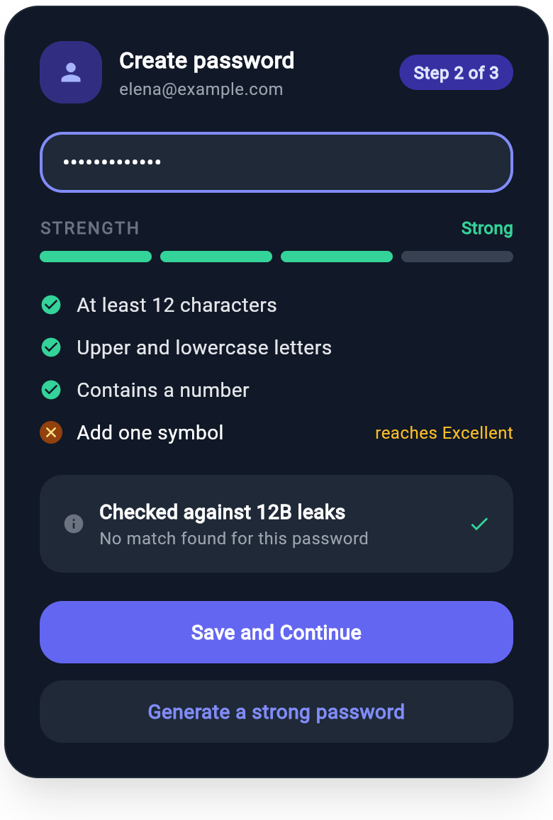
A sign-up password step that scores strength on a four segment meter, ticks off each requirement live, and confirms the password is not in a known breach list. Built with Wind className utilities and a real WInput field.
-
Flutter File Upload Card with Progress Bars
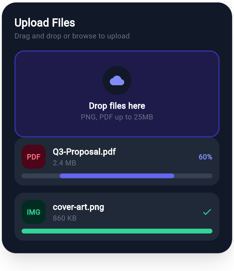
A file upload card with a drag-and-drop zone and per-file progress bars showing uploading and completed states. Styled with Tailwind-style Wind classes and dark-mode support.